Claude Code App Icon Design: 20 SVG Iterations for a macOS Dictation App
I redesigned the macOS app icon for Foil, a free dictation tool, using Claude Code and the logo-designer-skill. The brief: an abstract homage to Edison's 1877 tinfoil phonograph, no literal phonograph. Twenty SVG iterations later, this is where we landed:

Here are the major stops, and where Claude got stuck.
Round 1 — Generic Abstract (rejected)
Five parallel subagents, no Edison reference research. Rings, ribbons, recording grooves, an "F" letterform — competent, abstract, all wrong.
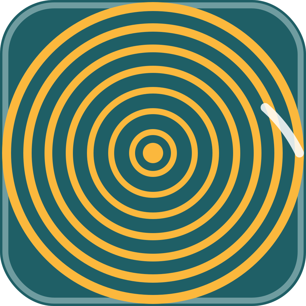
concept-1 — captured sound rings
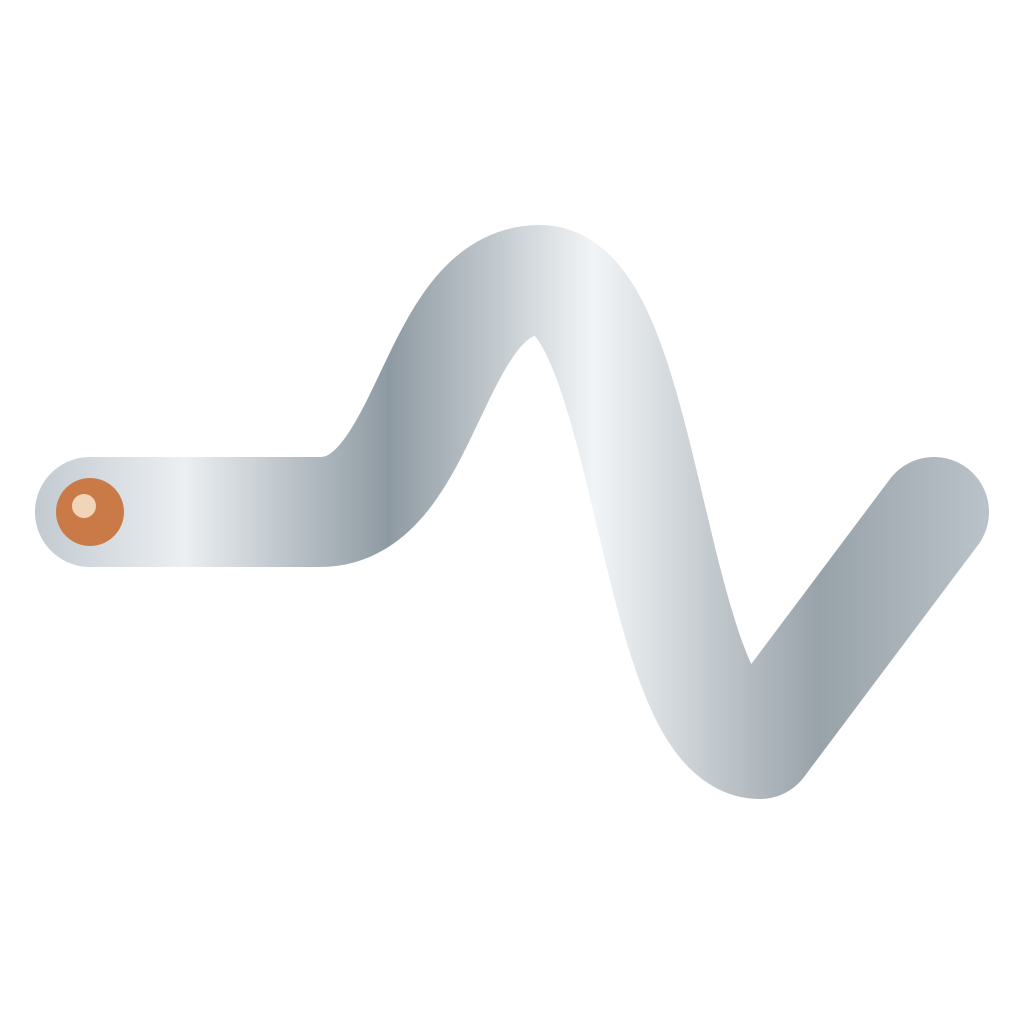
concept-2 — foil ribbon → waveform
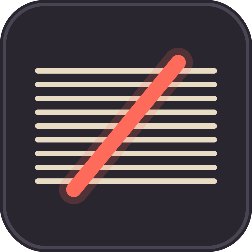
concept-3 — grooves + capture pulse

concept-4 — F from foil strips
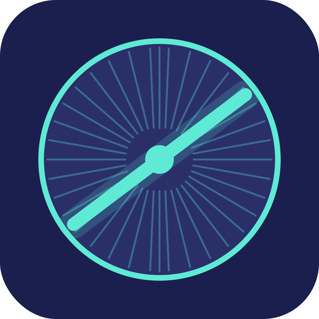
concept-5 — cross-section + pulse
← Scroll →
Round 2 — Edison-Grounded (closer)
Grounded in real research this time: a horizontal brass cylinder wrapped in tinfoil with a single helical groove at 10 threads per inch. Better, still not the answer.
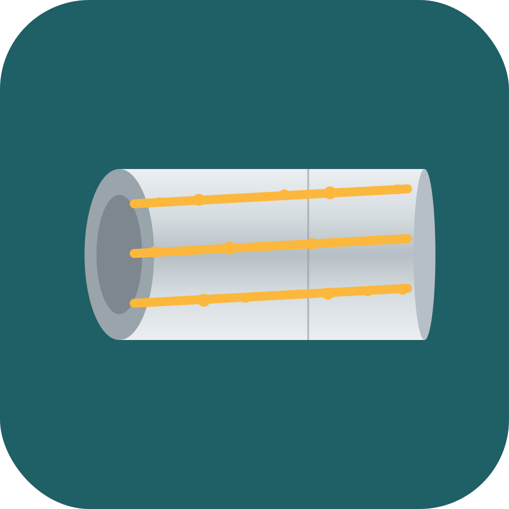
3/4 cylinder + helix + indentations
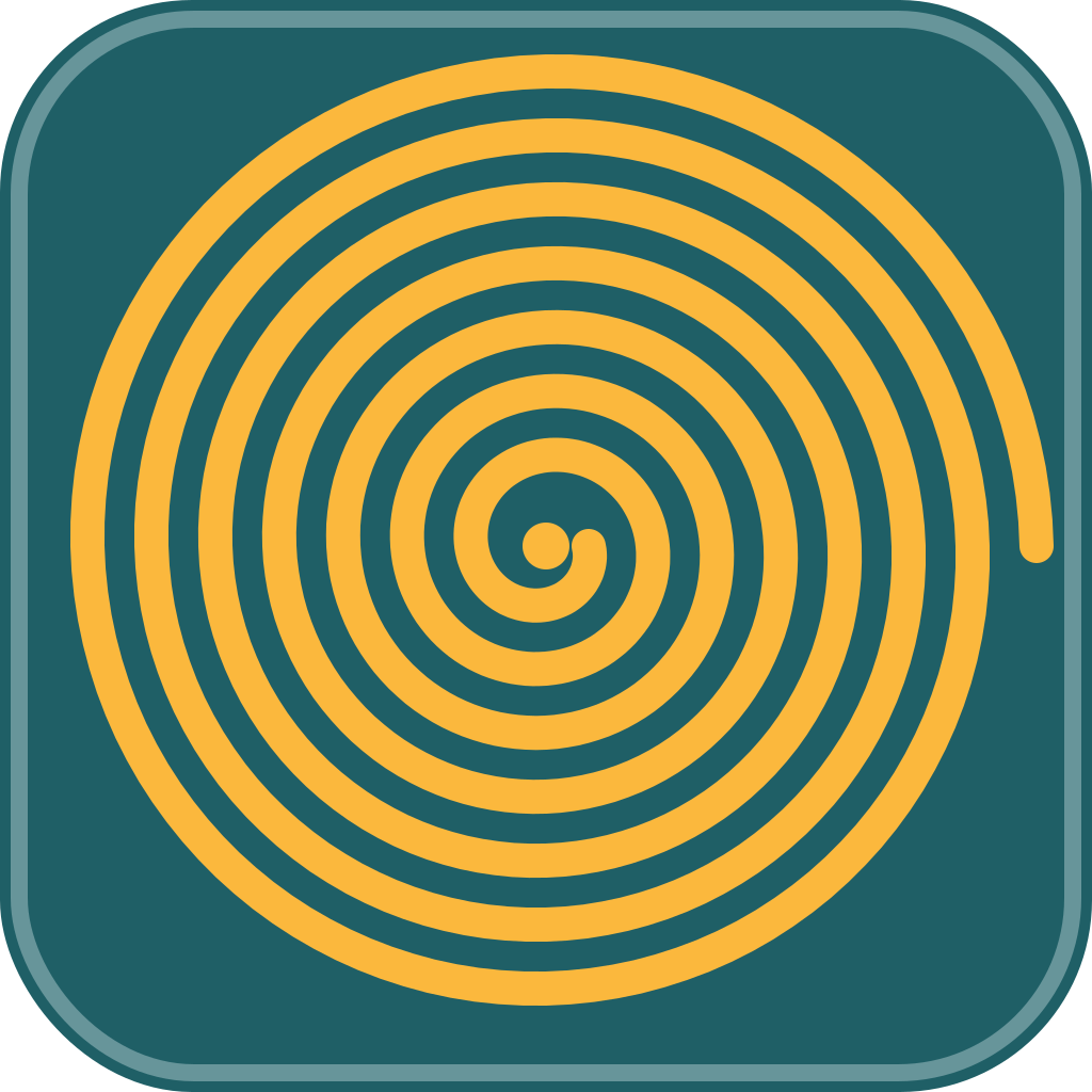
end-on continuous spiral
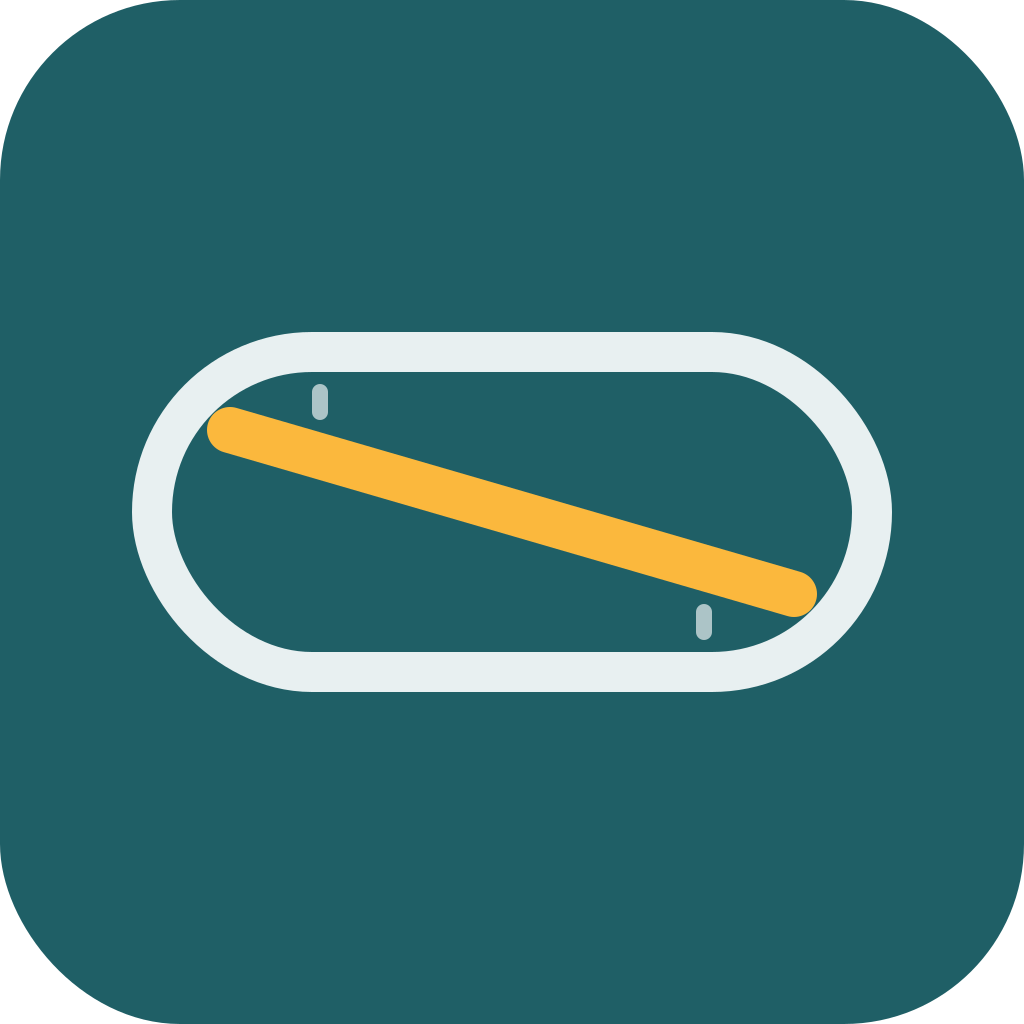
minimal capsule + diagonal
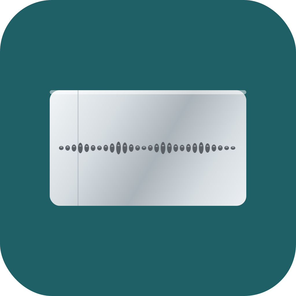
tinfoil sheet + sound indentations
← Scroll →
The Spiral Detour (twelve iterations)
I picked a direction and asked Claude to refine. The refinement turned into twelve iterations of spiral shapes — Archimedean spirals, spirals with bursts, denser spirals, sharper spirals. Structural problem: bend a periodic waveform into a closed curve and your brain reads it as a gear, never as audio.
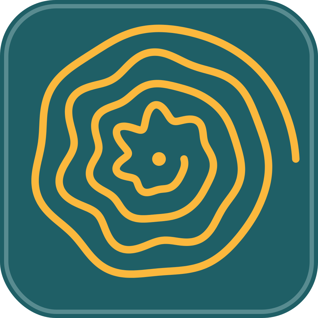
iter-4 — Archimedean + speech wiggle
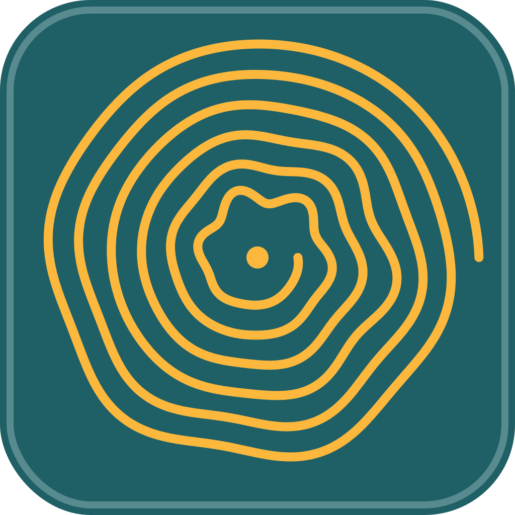
iter-7 — denser 6-turn groove
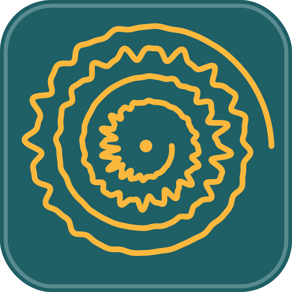
iter-9 — sharper mixed-frequency
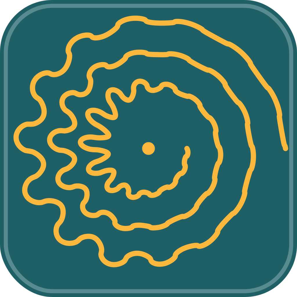
iter-11 — bold clipped-sine
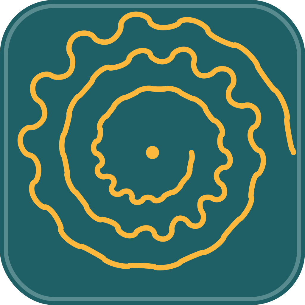
iter-12 — tamed center
← Scroll →
After iteration-12 I called it and restarted.
Round 3 — Six Lenses (unlocked it)
Hard reset. Six parallel subagents, each with a different creative lens — minimalist, letterform, material, motion, vintage, experimental. Constraining each agent broke the convergence.
geometric minimalist
letterform F
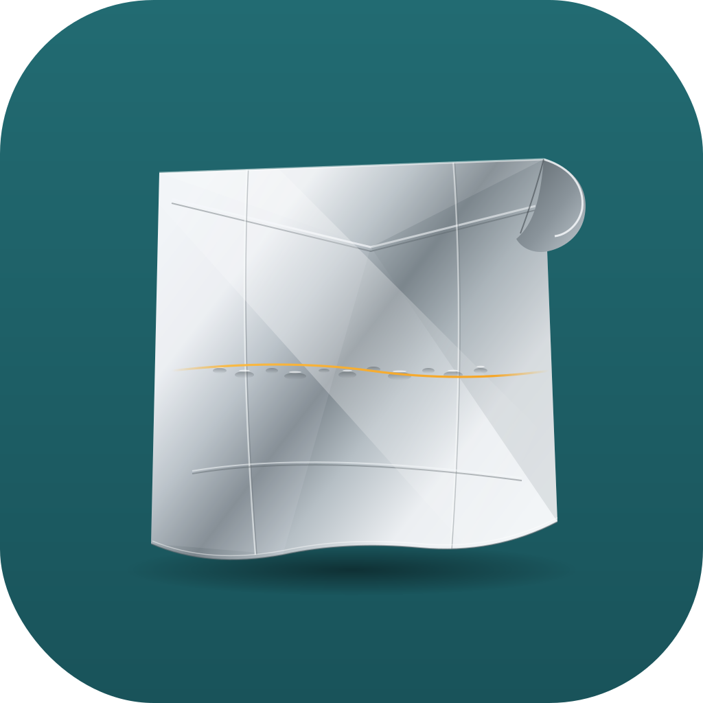
material / foil sheen
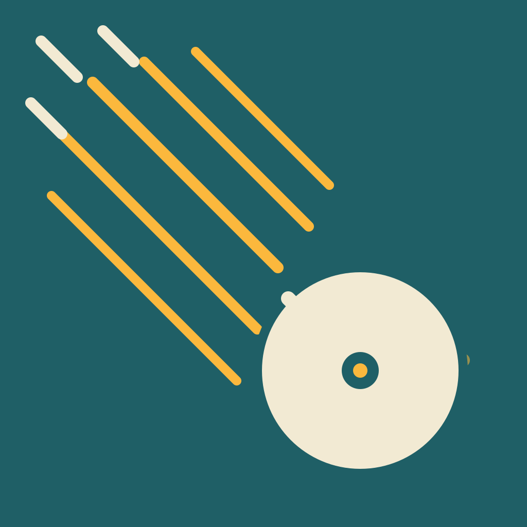
motion / capture in-progress
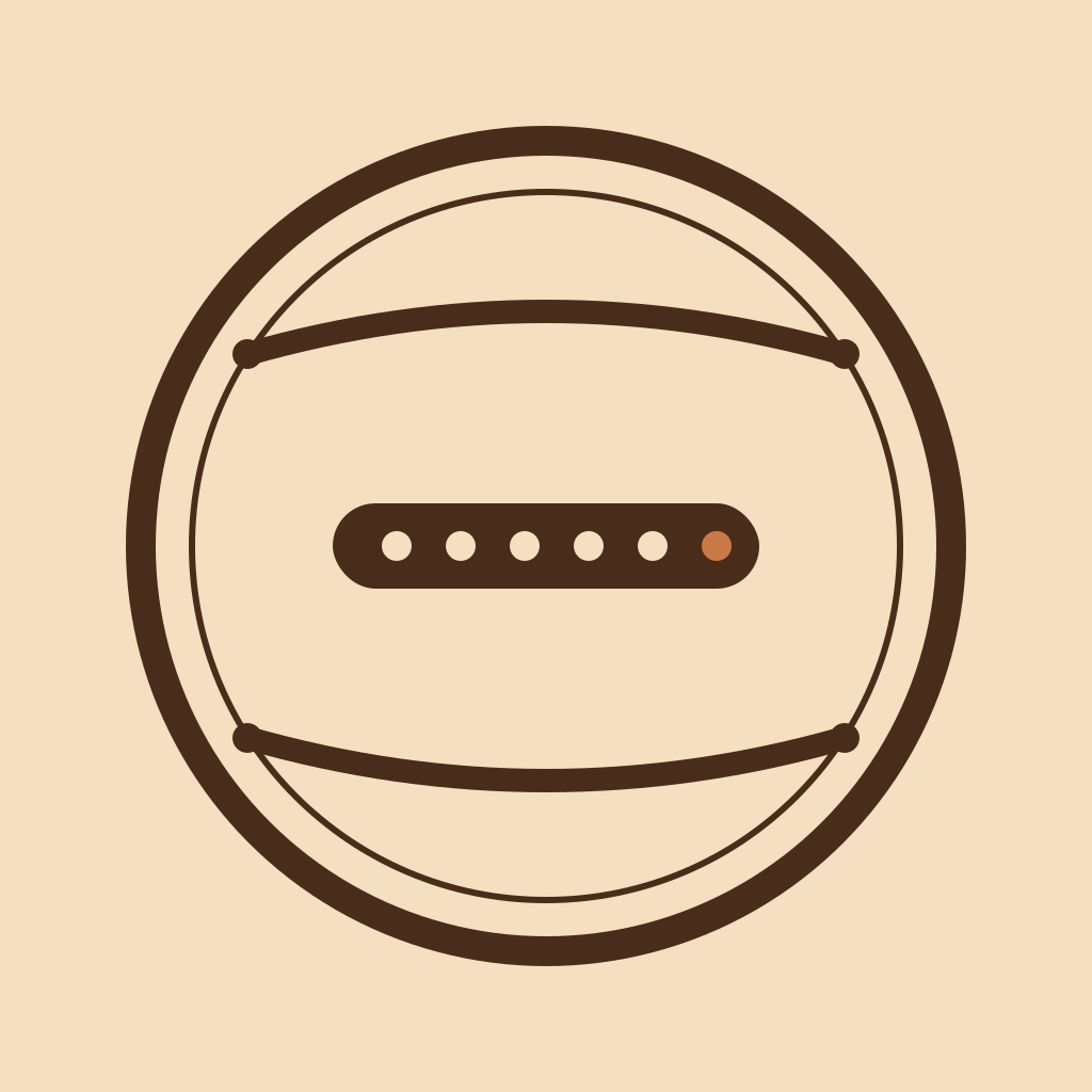
vintage emblem (modern)

experimental / off-axis
← Scroll →
The winner wasn't a single concept — it was concepts 1 and 3 merged: a horizontal cylinder with a sound wave inside it.
The Curvature Problem
This is where Claude got stuck. Once we had a cylinder, I asked Claude to "curve the sound waves along with the sheet." That instruction sounded clear when I typed it. It wasn't.

smile-arc — wrong: implies the center curves

right-edge perspective only — correct geometry
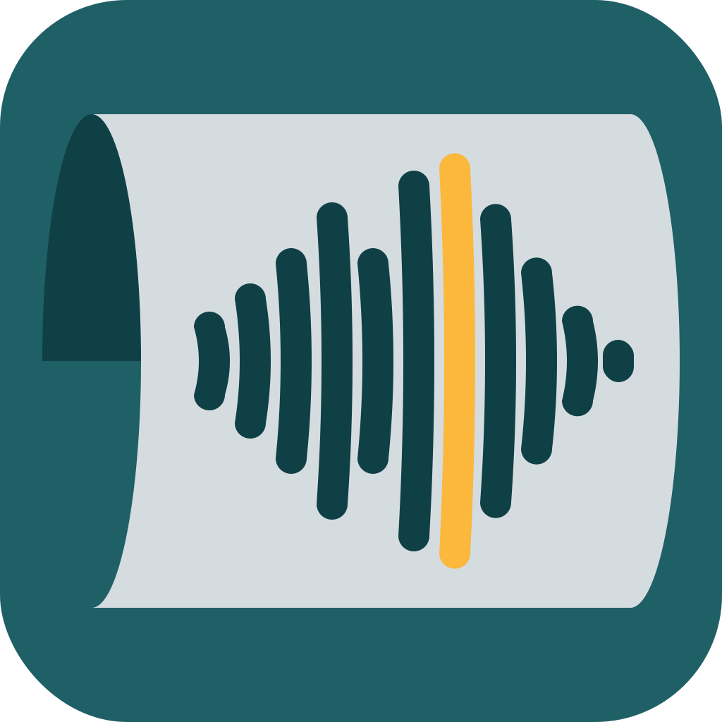
curved bars c=14 — too subtle
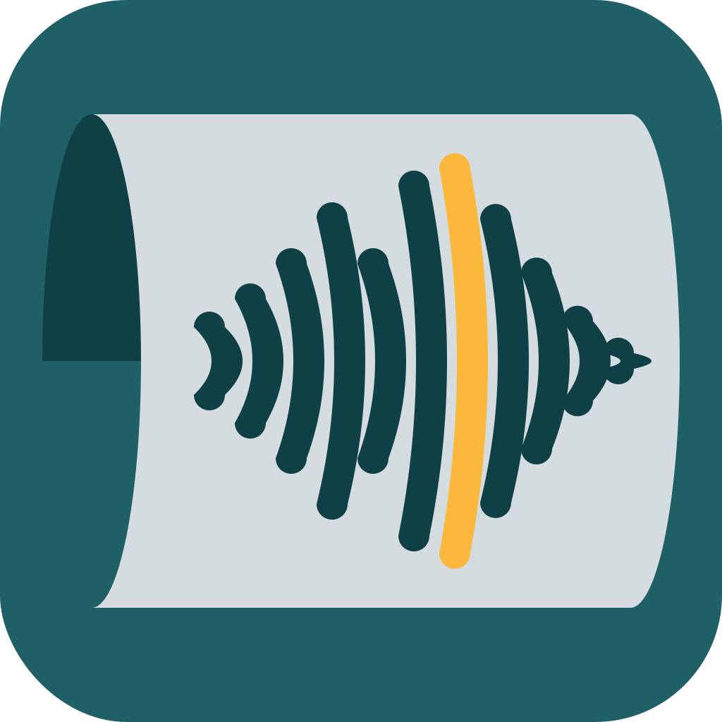
c=50 — bars curve like longitude lines
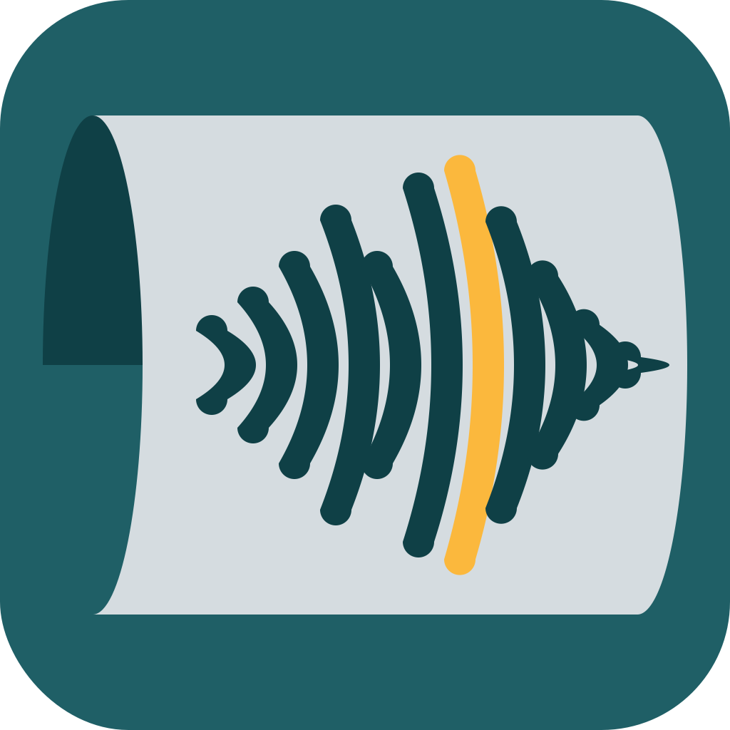
c=80 — crescent moons (too much)
← Scroll →
Claude's first interpretation was a smile-arc — bars bowing upward in the middle, like the wave was painted on a surface bulging toward the viewer. Geometrically wrong (the cylinder's center doesn't curve across its length, only the right edge does). I had to say "double check the curvature is not curved across the cylinder" before we got to right-edge-only perspective. Pushing further to actually curve each bar's shape worked at moderate intensity and looked silly at high intensity — and the curved version was technically more accurate but worse as an icon.
The Final
Straight bars, shifted slightly right, subtle right-edge perspective. One last move: change the body from light grey to pure white, pushing luminance contrast past WCAG AAA for the 16px menu-bar size.

The Counts
- 20 named iterations
- 119 SVG files generated
- ~60 distinct visual variations across the whole journey
- 3 rounds of fresh concepts (5 + 4 + 6 = 15 starting points)
- 12 iterations on the spiral dead end before restarting
- 1 geometric misunderstanding that ate ~5 iterations to untangle
What I Took Away
Claude's capabilities on this kind of task are spiky.
Some operations were nearly frictionless. Centering the sound wave on the cylinder, shifting it right, replacing the body color from grey to pure white, generating six distinct concepts in parallel — all landed in one or two attempts.
Other operations turned out to be surprisingly hard. The clearest example: getting Claude to curve the sound-wave bars along the cylinder's curvature. After we untangled the initial geometric misread (the smile-arc that implied the cylinder bows across its length), Claude could produce mathematically curved bars at any intensity I asked for — but none of them looked right:
We reverted to straight bars in iteration-19. Geometric fidelity and icon legibility turned out to be different optimization targets, and Claude couldn't navigate the gap between them without explicit steering from me.
The skill (logo-designer-skill) handles the structured flow — interview, parallel exploration, refinement, PNG export. Full walkthrough is here. And Foil is where the icon lives now.